Of all wristwatch categories, the field watch is the most honest.
No dive bezel, no pilot’s cluttered scale, no dress watch polished chamfer. It does exactly three things: tell the time, stay alive, and keep running.
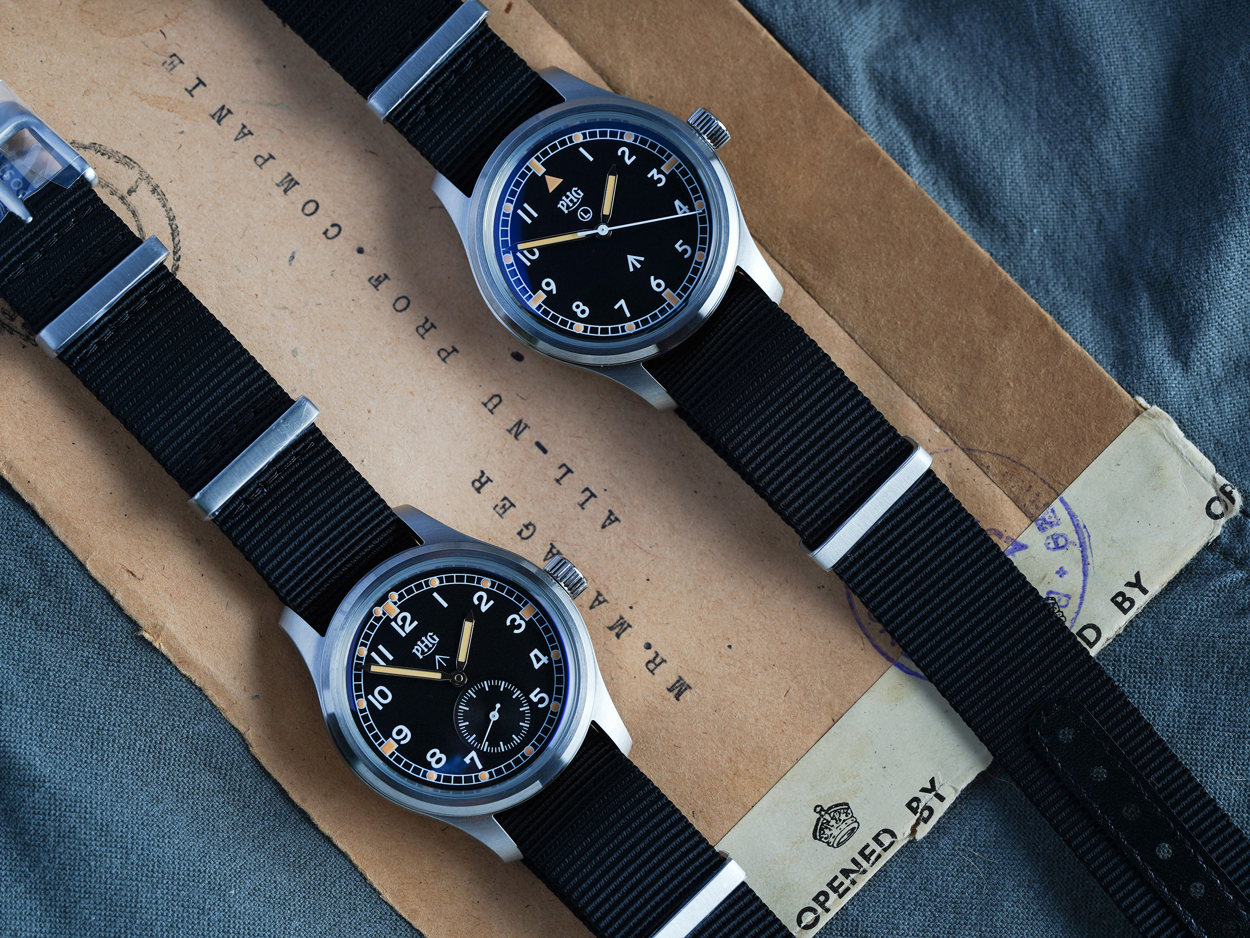
PHG’s Field Series comprises two watches. One represents the 1960s British Army procurement list; the other represents the largest military wristwatch tender in history, issued in 1945. Twenty years apart in design language, yet both answer the same question:
If you could give a soldier only one watch, what should it look like?
W10-1967: A Brief That Left No Room for Ego
In 1967, the British Army’s War Office issued Smiths a contract. The specification was a few sparse lines, each one surgically precise: case no larger than 36mm, water-resistant, shock-resistant, accuracy to military standard, legible at all times.
Nothing about “aesthetics.” Nothing about “brand.” Smiths delivered exactly to spec, and the W10 became a generational classic — because functionalism itself is the most compelling military design language.
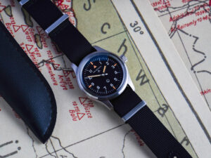
The W10-1967 is powered by the Seiko TMI VH31 sweep quartz movement, with the second hand gliding at 4 beats per second. 18mm NATO strap, 50m water resistance, dual-coated K1 crystal.
This is what a field watch should be: rain is fine, mud is fine, forgetting it exists is fine.
WO-1945: The Dirty Dozen, Reissued
In 1945, with war still burning across Europe, the British Ministry of Defence simultaneously issued a standard specification to twelve watch manufacturers — the WWW (Wrist Watch Waterproof). The requirements were brutally concise: black dial, Arabic numerals, luminous markers, water-resistant and shock-resistant.
Twelve manufacturers each submitted their answer: Buren, Cyma, Eterna, Grana, Jaeger-LeCoultre, Lemania, Longines, IWC, Omega, Record, Timor, Vertex. Though the details varied, every single one pointed to the same destination — functionalism pushed to its purest extreme. This is what collectors would later venerate as the “Dirty Dozen.”
What PHG set out to do is more complex than homage.
We aimed to recreate the texture of 1945 using the craftsmanship of 2026.
The Dial. The original Dirty Dozen dials were not the smooth, CNC-milled surfaces of modern watches. They had a fine, granular matte texture — the imprint of 1940s sandblasting, and the source of the dial’s entire “character.” To reproduce this texture, we ran dozens of colour-spraying iterations. Comparing colour swatches, adjusting grit size and spray angle alone consumed months. The resulting matte black dial won’t wash out into a pale sheet under harsh light, yet retains enough contrast in dim conditions — every adjustment was tested against simulated battlefield lighting.
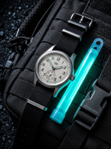
The Lume. In the 1940s, luminous paint was applied by brush — every marker and numeral bore the visible ridges of brush strokes, and the uneven thickness created a distinctive three-dimensional quality. Modern printing can achieve mirror-flat surfaces, but that was never what we wanted. PHG’s C3 Super-LumiNova coating was printed in over twenty layers — not because three wouldn’t suffice, but because only by “building up” that thickness can you replicate the swollen, hand-filled quality of original brush application. In daylight, it has the plump立体充盈 of a vintage watch; in darkness, it delivers even, cool luminescence. Two lighting conditions, one honesty.
The Movement. The WO-1945 uses a two-and-a-half-hand layout — a small seconds sub-dial at 6 o’clock — powered by the Miyota 1L45 quartz movement. This choice may be an industry first in Dirty Dozen reissues: no one has used the 1L45 for this purpose before. But we didn’t hesitate, because the 1L45’s sub-dial layout perfectly reproduces the visual proportions of the original Dirty Dozen’s small-seconds-to-main-dial ratio. One glance tells you — the proportions are right. Closer inspection finds nothing to fault. Authenticity isn’t a slogan; it’s the faithful reproduction of every proportional relationship.
The Typography. Dirty Dozen dial typography is something you can “feel but not describe.” Modern digital fonts are too uniform, too clean — they lack the subtle curves of 1940s hand-drawn lettering. PHG’s design team character-tuned each glyph against the originals — adjusting stroke weights, terminal angles, inter-digit spacing — to capture the spirit without resorting to crude copy-paste. From a distance, it reads as Dirty Dozen; up close, it carries PHG’s own restraint.
The Case. Looking at just one Dirty Dozen case isn’t enough; copying only one isn’t fair. PHG synthesised the finest line qualities across all twelve manufacturers — some had elegantly elongated lugs, others hard-edged bezel transitions — finding common ground and distilling them into a case language uniquely PHG’s. 36mm fully brushed 316L stainless steel, lean, compact, understated, and unyielding.
The PHG Promise: The Best Reissue on the Market
This statement is not a slogan. It means that every decision — from dial texture and lume thickness, to typography curvature, case geometry, and movement selection — must be resolved to a standard beyond “close enough.”
We are not making a watch that merely “looks like” the original. We are using the technology of 2026 to achieve the same mandate those twelve manufacturers were given in 1945:
Give a soldier a watch that is reliable under any condition — a military watch that belongs to its era.
Put it on, cinch the NATO strap, and forget about it. Until the day you’re somewhere that demands you know the exact time — look down, and it’s still there, still running, just like day one.