True sophistication is rarely about excess. More often, it lives in restraint and order.
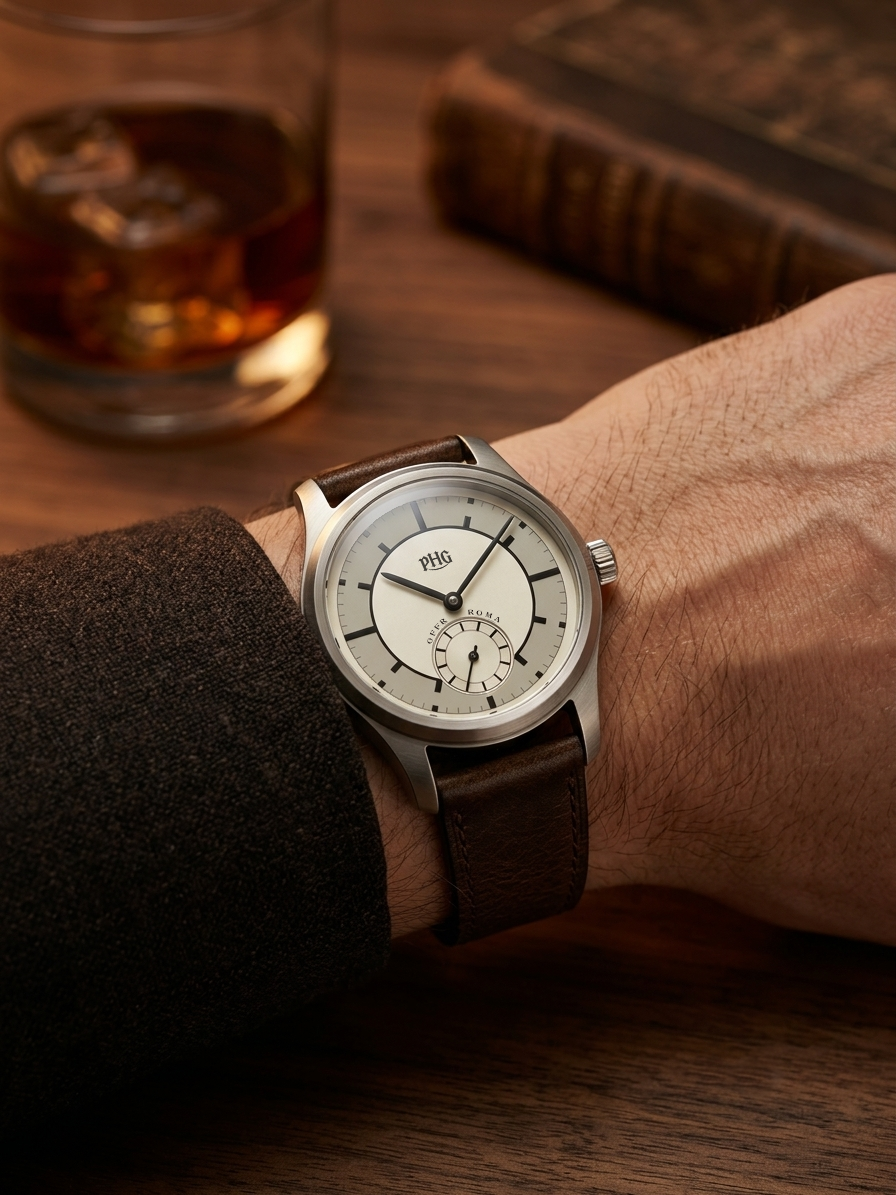
The PHG Officer Roma turns its gaze to the Sector Dial—a layout that defined the 1930s. This isn’t nostalgia for its own sake. It’s a modern conversation about geometry, proportion, and the quiet order of time.
Order and Geometry: The Logic of the Dial
Two concentric rings carve the dial with precision. A railway-minute track weaves into radially set hour markers, lending the face a three-dimensional, almost architectural sense of order. Born of the Bauhaus era’s rationalist spirit, this design turns the simple act of reading the time into a small, ritualistic pleasure for the eye.
Quiet Champagne Gold and a Subtle Glow
Forget the harshness of pure white. The dial wears a soft, faintly matte champagne gold—a tone that carries the patina of age without ever looking old. Set against a deep-black hand track and a recessed small-seconds subdial, warm and cool meet in a register that reads as effortlessly elegant.
Brushed Surfaces and the Restraint of a Domed Crystal
The case edges are finished with a fine micro-brushed texture that quietly retires the cheap cliché of mirror-polished shine, trading it for the composed gravity of serious metalwork. Paired with a gently domed “bubble” crystal, light travels along the curve—austere and warm at once.
For the Discerning Few
For those who prize a point of view over the crowd’s, this is more than a timepiece. It is a piece of 1930s industrial design, worn on the wrist.
DESIGN SHOULD ULTIMATELY LIVE ON THE WRIST.