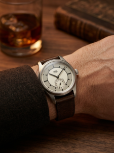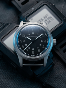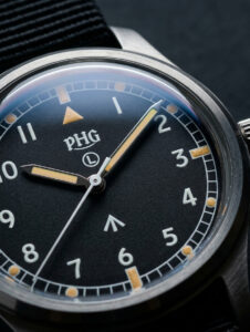

Look closely at the watches of today, and you will find that many designs we now take for granted are deeply rooted in military watch history.
Clear Arabic numerals. High-contrast black-and-white dials. Railroad minute tracks. Luminous hour markers. A central seconds hand.
These features seem completely ordinary today. Yet behind them all lies one shared logic: solve the function first, and the aesthetics will follow.
The most important mission of a military watch was to make time instantly readable – in flight, on the march, and in demanding environments.
So the dial had to stay simple. The numerals could not be ambiguous. The hands had to be legible at a glance. Decoration could never interfere with reading.
This demand for clarity and efficiency gradually matured into a complete design language for tool watches.
And when the war ended, that language did not disappear. It moved into civilian watches, and went on to shape field watches, pilot’s watches, and a large share of today’s tool watches.
So when we see a clean Arabic-numeral dial now, we rarely think twice. But look back at its history, and one thing becomes clear:
Many classics were never designed to be classics. They simply solved real problems.
That is why I love military watches. Not for the word “military” – but for the design logic behind it.
Function defines form, and form eventually becomes aesthetics.
That is also where PHG began.
DESIGN SHOULD ULTIMATELY LIVE ON THE WRIST.